Assignment 3, Group 1: Using a multi-level linear model

Summary & Our Definition of Fairness

Before delving into the data and running any analysis, we determined that our metric for fairness would be based on “equal-opportunity” of being searched, i.e. the question we wanted to answer was: do people who live in certain areas or look a certain way more likely to be searched with no arrest? By certain areas, we mean the population breakdown of precincts, i.e. if a neighbourhood is more skewed towards a certain demographic, does it impact the likelihood of a stop and frisk?

“Disparate impact” in the U.S. Labor Law refers to activities that adversely affect a group of people of a protected characteristic (say race). This can be applied to fairness in stop-and-frisk, i.e. do people of a protected characteristic get more adversely impacted with stop-and-frisk, i.e. are there a lower number of hits?

We decided to break it down by precinct as opposed to census block, as that’s how the NYPD bureaus are divided. The fairness question that this analysis raises is with respect to the police: were the stops fair? And, if not, which precincts were particularly unfair?

Initial Investigation

Initially, before running the linear model, we ran through some basic number crunching to see if there was any evidence of unfairness. Here, we looked at two things:

  •  Figure 1 shows the hit ratio for violent crimes, by precinct, across blacks, whites, black Hispanics and white Hispanics. Here, we saw that the (twelve) lowest hit ratios were distributed between Black Hispanics (4), Whites (7) and a single white Hispanic.
    Further investigation suggested that, for the most part, the hit ratio was at around the 0.05 mark. Interestingly, for some precincts (20, 32, 42, 45, 48), where the hit ratio for non-whites was very low, the hit ratio for Whites was significantly higher.
    On the other hand, in some precincts (50, 76, 78), the hit ratio for blacks was much higher than the hit ratio for whites.
    Effectively, there was no evidence of unfairness across the board, but if we narrowed it down by precinct, there was evidence of bias.
plot

Figure 1: Hit ratio by precinct

  • Figure 2.1, 2.2 and 2.3 plot the hit ratios for blacks against precincts with different racial backgrounds. The idea behind this was: if there is racial bias in a precinct, then the hit rate for blacks in that community will be low. Or, put another way, are people more suspicious of a minority community in their midst for no good reason (which would explain the low hit rate)?
    Here, we found that in a predominantly white precinct (where 80-100% of the population was white), the hit ratio for blacks was at 0.11, whereas at a precinct where there were less than 20% whites, the number was at 0.02. But, the hit ratio for whites was, for the most part, constant ~0.08.
    In neighbourhoods that were predominantly Hispanic, on the other hand (60-80%), the hit ratio was low at 0.01. Here, the hit rate for whites was ~0.065. However, when there were less than 20% Hispanics, the hit ratio exceeded 0.07. And, for whites, it exceeded 0.08.
    Finally, in the hit ratio was high (exceeded 0.08) in precincts where the black population was sub-20% but low (0.01) where over 80% of the population was black.
    While these was interesting to note, the numbers weren’t outlandishly skewed, and consequently, there was no obvious bias evident.
Figure 2.1: Hit ratio for blacks broken down by race: black

Figure 2.1: Hit ratio for blacks broken down by precinct and race: black

Figure 2.2: Hit ratio for blacks broken down by precinct by race: Hispanic

Figure 2.2: Hit ratio for blacks broken down by precinct and race: Hispanic

Hit ratio for blacks broken down by precinct and race: White

Hit ratio for blacks broken down by precinct and race: white

Method

We ran two regressions – one on race and one on the likelihood of being detained for a reported interaction in precincts based on the racial makeup of that precinct. The precinct racial makeup data was taken from all NYC2010 census blocks with the precinct, modified by John Keefe.

Race coefficients:

First, we took a look at the differences between race after applying random effects to sex, precinct and age. Our findings show that when looking at all crime, there is not much difference between whites and blacks. Both were slightly more likely than all other races but one (P and Q together form the Hispanic group) to produce a hit. This seems to show that both whites and blacks are policed more reasonably than other races because they produce fewer stops without arrests.

However, when you remove all non-violent crime, whites are the only race where the odds of a stop producing a hit increases. All the heavily represented races (lower std. deviation) converge to zero when we remove non-violent crime, showing that there’s much less disparity. Yet, there still appears to be some racial discrimination toward non-whites.

Race coefficeint

Race coefficients with random effects on age, sex, pct

screen-shot-2016-11-04-at-8-31-34-am

Race coefficients (Violent crimes only) with random effects on sex, age, precinct

Precinct coefficients:

By running a regression on the percentage of each precinct that was of a given race for black, white and Hispanic, we hoped to be able to identify any racial disparities between policing in particular precincts.

Both the violent-only and full set of data seem to show significant differences between whites and blacks. When factoring in non-violent crime, it appears black communities have many more stops without arrests than either the white or the Hispanic communities.

Our findings also seem to show predominantly white communities could use more policing to cut down on violent crime, as stopping a person in a white precinct increases the chances of a hit when only looking at violent crime. However, black and Hispanic communities are pretty much on par with each other with violent-only crime.

screen-shot-2016-11-04-at-8-32-53-am

Arrests by Precinct with random effects on age, sex

screen-shot-2016-11-04-at-8-34-23-am

Arrests by Precincts (violent crimes only)

Residual effects:

We can see that if we breakdown our LME model by hit ratio vs. the precinct (with random effects on precinct), we get a fairly straight line, indicating that we get a fairly reliable predictor using just the precinct.

pct_random

What is interesting, though, is that this doesn’t change significantly when we add race to the mix, indicating that using the precinct in isolation doesn’t decrease the reliability of the predictor compared to using a combination of the precinct and race.

There would be no disparate impact if the probability of hits given race is equivalent to the probability of hits when race is absent (i.e. P(hits | race == 1) ≈ P(hits | race == 0)). We can see that this is the case here.

pct_random2

Final thoughts 

For the most part, through this exercise, we didn’t see a lot of bias in policing. There is evidence that some precinct are more biased – or more unfair – than others, using our definition of “unfairness”, but not enough where we can claim there is systematic bias.

The residual effects chart is probably the most interesting, as it seems to indicate that throwing race into the mix doesn’t improve predictability – but, that could be explained by bias already being built into the precinct. Or, because, policing had become more careful in the early 2010s after the accusations of bias in the mid-to-late noughties.

Adding NYPD Precinct to Stop & Frisk Data

Here’s a tutorial on the steps I went through to generate the data for Assignment 3, statistical modeling of stop & frisk data with precinct as the unit of analysis. The first problem is adding a precinct ID to every stop and frisk event, which means matching stop locations to precinct areas. To get baseline racial makeup we also need to sum census data over precincts.

Thanks to John Keefe of WNYC for valuable data and advice.

Just the data

  • Here is NYPD’s 2011 stop & frisk data, with appended precinct and lat/long. The column names are explained here.
  • Here are all all NYC 2010 census blocks, with appended precinct, from John Keefe, and here is the census data dictionary (see pp.6-10)

How to make this data

1. First, download NYPD raw stop and frisk data here. I used 2011, since that was the year with the most stops before the program was drastically curtailed. There’s also documentation on that page, which explains the data format

2. The XCOORD and YCOORD columns record the position of each stop, in the “New York-Long Island State Plane Coordinate System” also known as EPSG 2908. To do anything useful with this, we’re going to need to convert into lat/long using QGis. Use Layer -> Add Layer -> Add Delimited Text Layer to load the CSV file. It should automatically guess the correct column names. When asked, pick EPS 2908 for the coordinate system. If all goes well, you are now looking at this:

NYPD 2011 Stop and Frisk data in QGis

3. We need to save this in a more standard coordinate system for comparison to precinct boundaries. Right click on the “2011” layer and Save As as an ESRI Shapefile with CRS (“coordinate reference system”) of WGS84, which should also be the “Project CRS.” Ensure “add saved file to map” is checked. Now you’ve got a new layer in standard GPS-style lat/long coordinates.

4. Now we need to know the geographic outlines for each police precinct. The raw shape files are here, or your can look at them in a Fusion Table here. In QGIS, Use Add Layer -> Add Vector Layer and select the precinct shapefile (nypp_4326.zip).

5. To assign points to their precinct, run Add polygon attributes to point in the data processing toolbox (Processing -> Toolbox). The “Precinct” field should appear automatically. Again you’ll have a new layer. Right click and save that as a CSV. You should end up with a file that is exactly the same as the NYPD’s 2011 CSV, but with lat/long and precinct columns added.

6. Keefe has also done the work of enriching New York City census blocks with precinct keys, which he’s put in this this  Fusion Table. The data above is a CSV download of this file.


Assignment 3: Analyze Stop and Frisk for Racial Bias

For this exercise, you will break into three groups. Two will analyze data, and the third will do legal research. The data for this assignment is available here. All groups will turn in their assignment by posting on this blog — you’ll have logins shortly — and linking to a github repository of your code.

All groups: How can we encode our ideas about racial fairness into a quantitative metric? That is the fundamental question underlying this assignment and you must answer it. Don’t build models that give you answers to useless questions; each model you build must embody some justifiable concept of fairness. Many such metrics have been proposed; part of the assignment is researching and evaluating them. I’ve proposed some models that might be interesting, but I’ll be just has happy — perhaps happier — to have you tell me why these particular model formulations will not yield an interesting result. Also, you have to tell me what your modeling results mean. Is there bias? In what way, how significant is it, and what are alternate explanations? Uninterpreted results will not get a passing grade.

Group 1: Analyze the stop and frisk data using a multi-level linear model

This group will analyze the data along the lines of Gelman 2006. However, that paper used Bayesian estimation whereas this team will used standard linear regression. Use RStudio with the lme4 package, as described in this tutorial.

As above, you need to choose and justify quantitative definitions of fairness. Should you look at stop rate? Hit rate? And should you compare to the racial composition of each precinct? Or per-race crime rates? And if so, which crimes?

Each conceptual definition of fairness can be embodied in many different statistical models. Compare at least two different statistical formulations. For example you might end up modeling:

  • hit rate vs race, per precinct
  • hit rate vs race, per precinct, with precinct random effects

You must also choose the unit of analysis. Is precinct or census block a better unit? Why? Or you could compare the same model on different units.

Your final post must include a justification of the metric and model choices, and useful visualization of the results, and interpretation of both the regression coefficients and uncertainty measures (standard errors on regression coefficients, and modeling residuals.)

Group 2: Analyze the stop and frisk data using a Bayesian model

This group will analyze the data along the lines of Simoiu 2016. For a tutorial on how to set up Bayesian modeling in R, see Bayesian Linear Mixed Models using STAN.

As with group 2, you must research and choose a definition of fairness, fit at least two different statistical formulations, and interpret your results including the uncertainty (posterior distributions and residuals.) Be sure to visualize your model fit, as in figure 7 of Simoiu.

I would be happy to see you replicate the threshold test of Simoiu. However, I want you to explain why the threshold test makes sense as a fairness metric. If it doesn’t make sense I want you to design a new model. Perhaps the assumption that each officer can make correctly calibrated estimates of the probability that someone is carrying contraband is unrealistic, and your model should be based on the idea that the estimates are biased and try to model that bias as latent variables.

Group 3: Research legal and policy precedent for statistical tests

This group will scour the legal literature to determine what sorts of statistical tests have been used, or could be used, to answer legal questions of discrimination. You will also research the related policy literature: what sorts of tests have governments, companies, schools etc. used to evaluate the presence or significance of discrimination. For an entry into the literature, you could do worse than to start with the works referenced by Big Data’s Disparate Impact.

This group will not be coding, but I expect you to ask not only what fairness metrics might be appropriate (as the other groups must also do) but 1) whether or not these metrics might hold up in court and 2) whether they have ever been used outside of court.

And one particular question I would like you to answer: would Simiou’s “threshold test” have legal or policy relevance?

Submitting your Results

All groups will report their results on this blog, and present their findings to the class on Friday, November 4.

Syllabus Fall 2016

The course is a hands-on introduction to the areas of computer science that have a direct relevance to journalism, and the broader project of producing an informed and engaged public. We will touch on many different technical and social topics: information recommendation systems but also filter bubbles, principles of statistical analysis but also the human processes which generate data, network analysis and its role in investigative journalism, visualization techniques and the cognitive effects involved in viewing a visualization. Assignments will require programming in Python, but the emphasis will be on clearly articulating the connection between the algorithmic and the editorial.

Our scope is wide enough to include both relatively traditional journalistic work, such as computer-assisted investigative reporting, and the broader information systems that we all use every day to inform ourselves, such as search engines and social media. The course will provide students with a thorough understanding of how particular fields of computational research relate to journalism practice, and provoke ideas for their own research and projects.

Research-level computer science material will be discussed in class, but the emphasis will be on understanding the capabilities and limitations of this technology. Students with a CS background will have opportunity for algorithmic exploration and innovation, however the primary goal of the course is thoughtful, application-oriented research and design.

Format of the class, grading and assignments.
This is a fourteen week course for Masters’ students which has both a six point and a three point version. The six point version is designed for CS & journalism dual degree students, while the three point version is designed for those cross listing from other schools. The class is conducted in a seminar format. Assigned readings and computational techniques will form the basis of class discussion. The course will be graded as follows:

  • Assignments: 80%. There will be a homework assignment after most classes.
  • Class participation: 20%

Assignments will be completed in groups (except dual degree students, who will work individually) and involve experimentation with fundamental computational techniques. Some assignments will require intermediate level coding in Python, but the emphasis will be on thoughtful and critical analysis. As this is a journalism course, you will be expected to write clearly.

Dual degree students will also have a final project. This will be either a research paper, a computationally-driven story, or a software project. The class is conducted on pass/fail basis for journalism students, in line with the journalism school’s grading system. Students from other departments will receive a letter grade.

Week 1: Introduction and Clustering – 9/16
Slides
First we ask: where do computer science and journalism intersect? CS techniques can help journalism in four different areas: data-driven reporting, story presentation, information filtering, and effect tracking. Then we jump right into high dimensional data analysis and visualization, which we’ll need to study filtering, with an example of clustering, visualizing, and interpreting feature vectors of voting patterns.

Required

Recommended

  • Precision Journalism, Ch.1, Journalism and the Scientific Tradition, Philip Meyer

Viewed in class

Unit 1: Filtering

Week 2: Text Analysis – 9/23
Slides
Can we use machines to help us understand text? In this class we will cover basic text analysis techniques, from word counting to topic modeling. The algorithms we will discuss this week are used in just about everything: search engines, document set visualization, figuring out when two different articles are about the same story, finding trending topics. The vector space document model is fundamental to algorithmic handling of news content, and we will need it to understand how just about every filtering and personalization system works.

Required

Recommended

Examples

  • Watchwords: Reading China Through its Party Vocabulary, Qian Gang

Assignment:  LDA analysis of State of the Union speeches.

Week 3: Filtering algorithms
Slides
This week we begin our study of filtering with some basic ideas about its role in journalism. We will study the details of several algorithmic filtering approaches including Twitter, Reddit’s comment ranking, the Newsblaster system  (similar to Google News) and the New York Times recommendation engine.

Required

Recommended

Discussed in class

Week 4: Filters as Editors 
Slides
We’ve seen what filtering algorithms do, but what should they do? This week we’ll study the social effects of filtering system design, how Google Search and other systems are optimized in practice, and start to ask about possible ill effects like polarization and fake news.
Required

Recommended

Viewed in class

Assignment – Design a filtering algorithm for an information source of your choosing

Unit 2: Interpreting Data

Week 5: Quantification, Counting, and Statistics
Slides
Every journalist needs a basic grasp of statistics. Not t-tests and all of that, but more grounded. Where does data come from at all? How do we know we’re measuring the right thing, and measuring it properly? Then a solid understanding of the concepts that come up most in journalism: relative risk, conditional probability, the regressions and control variables, the use of statistical models generally. Finally, the state of the art in data-driven tests for discrimination.

Recommended

Week 6: Drawing conclusions from data 
Slides
This week is all about using data to report on ambiguous, complex, charged issues. It’s incredibly easy to fool yourself, but fortunately, there is a long history of fields grappling with the problem of determining truth in the face of uncertainty, from statistics to intelligence analysis. This week includes: statistical testing and statistical significance, Bayesianism in theory and practice, determining causality, p-hacking and reproducibility, analysis of competing hypothesis.

Required

Recommended

Viewed in class

Assignment: Analyze NYPD stop and frisk data for racial discrimination. Details here.

Week 7: Algorithmic Accountability 
Slides
Our society is woven together by algorithms. From high frequency trading to predictive policing, they regulate an increasing portion of our lives. But these algorithms are mostly secret, black boxes form our point of view. We’re at they’re mercy, unless we learn how to interrogate and critique algorithms. We’ll focus in depth on analysis of discrimination of various types, and how this might (or might not) be possible in computational journalism.

Required

Recommended

Unit 3: Methods

Week 8: Visualization 
Slides
An introduction into how visualization helps people interpret information. Design principles from user experience considerations, graphic design, and the study of the human visual system. The Overview document visualization system used in investigative journalism.

Required

Recommended

Week 9: Knowledge representation 
Slides
How can journalism benefit from encoding knowledge in some formal system? Is journalism in the media business or the data business? And could we use knowledge bases and inferential engines to do journalism better? This gets us deep into the issue of how knowledge is represented in a computer. We’ll look at traditional databases vs. linked data and graph databases, entity and relation detection from unstructured text, and traditional both probabilistic and propositional formalisms. Plus: NLP in investigative journalism, automated fact checking, and more.

Required

Recommended

Viewed in class

Assignment: Text enrichment experiments using StanfordNER entity extraction.

Week 10: Network analysis 
Slides
Network analysis (aka social network analysis, link analysis) is a promising and popular technique for uncovering relationships between diverse individuals and organizations. It is widely used in intelligence and law enforcement, but not so much in journalism. We’ll look at basic techniques and algorithms and try to understand the promise — and the many practical problems.

Required

Recommended

Examples:

Assignment: Compare different centrality metrics in Gephi.
Week 11: Privacy, Security, and Censorship 
Slides
Who is watching our online activities? How do you protect a source in the 21st Century? Who gets to access to all of this mass intelligence, and what does the ability to survey everything all the time mean both practically and ethically for journalism? In this lecture we will talk about who is watching and how, and how to create a security plan using threat modeling.

Required

Recommended

Assignment: Use threat modeling to come up with a security plan for a given scenario.

Week 12: Tracking flow and impact 

How does information flow in the online ecosystem? What happens to a story after it’s published? How do items spread through social networks? We’re just beginning to be able to track ideas as they move through the network, by combining techniques from social network analysis and bioinformatics.

Required

Recommended

 Final projects due 12/31  (dual degree Journalism/CS students only)

Assignment 4

For this assignment, each group will take one of the following four scenarios and design a security plan. More specifically, you will flesh out the scenario, create a threat model, come up with a plausible security plan, and analyze the weaknesses of your plan.

1. You are a photojournalist in Syria with digital images you wants to get out of the country. Limited internet access is available at a cafe. Some of the images may identify people working with the rebels who could be targeted by the government if their identity is revealed. In addition you would like to remain anonymous until the photographs are published, so that you can continue to work inside the country for a little longer, and leave without difficulty.

2. You are working on an investigative story about the CIA conducting operations in the U.S., in possible violation the law. You have sources inside the CIA who would like to remain anonymous. You will occasionally meet with these sources in but mostly communicate electronically. You would like to keep the story secret until it is published, to avoid pre-emptive legal challenges to publication.

3. You are reporting on insider trading at a large bank, and talking secretly to two whistleblowers. If these sources are identified before the story comes out, at the very least you will lose your sources, but there might also be more serious repercussions — they could lose their jobs, or the bank could attempt to sue. This story involves a large volume of proprietary data and documents which must be analyzed.

4. You are working in Europe, assisting a Chinese human rights activist. The activist is working inside China with other activists, but so far the Chinese government does not know they are an activist and they would like to keep it this way. You have met the activist once before, in person, and have a phone number for them, but need to set up a secure communications channel.

These scenario descriptions are incomplete. Please feel free to expand them, making any reasonable assumptions about the environment or the story — though you must document your assumptions, and you can’t assume that you have unrealistic resources or that your adversary is incompetent.

Start by creating a threat model, which must consider:

  • What must be kept private? Specify all of the information that must be secret, including notes, documents, files, locations, and identities — and possibly even the fact that someone is working on a story.
  • Who is the adversary and what do they want to know? It may be a single person, or an entire organization or state, or multiple entities. They may be very interested in certain types of information, e.g. identities, and uninterested in others. List each adversary and their interests.
  • What can they do to find out? List every way they could try to find out what you want secret, including technical, legal, and social methods.
  • What is the risk? Explain what happens if an adversary succeeds in breaking your security. What are the consequences, and to whom? Which of these is it absolutely necessary to avoid?

Once you have specified your your threat model, you are ready to design your security plan. The threat model describes the risk, and the goal of the security plan is to reduce that risk as much as possible.

Your plan must specify appropriate software tools, plus how these tools must be used. Pay particular attention to necessary habits: specify who must do what, and in what way, to keep the system secure. Explain how you will educate your sources and collaborators in the proper use of your chosen tools, and how hard you think it will be to make sure everyone does exactly the right thing.

Also document the weaknesses of your plan. What can still go wrong? What are the critical assumptions that will cause failure if it turns out you have guessed wrong? What is going to be difficult or expensive about this plan?

Include in your writeup (5 pages max):

  • A more detailed scenario, including all the assumptions you have made to flesh out the situation.
  • A threat model answering the four questions above.
  • A security plan including tools, procedures, necessary habits.
  • A training plan, explaining how you are going to teach everyone involved to execute the security plan.
  • An analysis of the vulnerability of your plan. What can still go wrong?

Due last class, Dec 10.


Week 10: Drawing Conclusions from Data

This week we looked at how to determine if what you think you’re seeing in your data is actually there. It was a warp speed introduction to a big chunk of what humanity now knows about truth-finding methods. Most of the ideas behind the methods are centuries or sometimes millennia old, but they were very much fleshed out in the 20th century, and these profound ideas haven’t percolated through to all disciplines yet.

Slides.

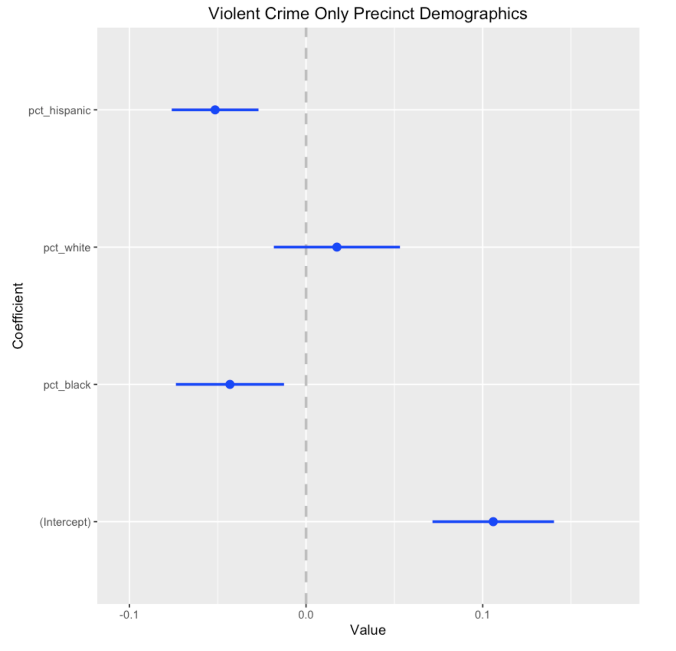
 “Figuring out what is true from what we can see” is called inference, and begins with a strong feel for how probability works, and what randomness looks like. Take a look at this picture (from the paper Graphical Inference for Infovis), which shows how well 500 students did on each of nine questions, each of which is scored from 0-100% correct.

Is there a pattern here? It looks like the answers on question 7 cluster around 75% and then drop off sharply, while the answers for question 6 show a bimodal distribution — students either got it or they didn’t.

Except that this is actually completely random synthetic data, drawn from a uniform distribution (equal chance of every score.) It’s very easy to make up narratives and see patterns that aren’t there — a human tendency called apohenia. To avoid fooling yourself, the first step is to get a feel for what randomness actually looks like. It tends to have a lot more structure, purely by chance, than most people imagine.

Here’s a real world example from the same paper. Suppose you’re interested to know if the pollution from the Texas oil industry causes cancer. Your hypothesis is that if refineries or drilling release carcinogens, you’ll see higher cancer rates around specific areas. Here’s a plot of the cancer rates for each county (darker is more cancer.) One of these plots is real data, the rest are randomly generated by switching the counties around. (click for larger.)

Can you tell which one is the real data? If you can’t tell the real data from the random data, well then, you don’t have any evidence that there is a pattern to the cancer rates.

In fact, if you show these pictures to people (look at the big version), they will stare at them for a minute or two, and then most folks will pick out plot #3 as the real data, and it is. This is evidence (but not proof) that there is a pattern there that isn’t random — because it looked different enough from the random patterns that you could tell which plot was real.

This is an example of a statistical test. Such tests are more typically done by calculating the odds that what you see has happened by chance, but this is a purely visual way to accomplish the same thing (and you can use this technique yourself on your own visualizations; see the the paper for the details.)

It’s part of the job of the journalist to understand the odds. In 1976, there was a huge flu vaccination program in the U.S. In early October, 14 elderly people died shortly after receiving the vaccine, three of them in one day. The New York Times wrote in an editorial,

It is conceivable that the 14 elderly people who are reported to have died soon after receiving the vaccination died of other causes. Government officials in charge of the program claim that it is all a coincidence, and point out that old people drop dead every day. The American people have even become familiar with a new statistic: Among every 100,000 people 65 to 75 years old, there will be nine or ten deaths in every 24-­‐hour period under most normal circumstances.

Even using the official statistic, it is disconcerting that three elderly people in one clinic in Pittsburgh, all vaccinated within the same hour, should die within a few hours thereafter. This tragedy could occur by chance, but the fact remains that it is extremely improbable that such a group of deaths should take place in such a peculiar cluster by pure coincidence.

Except that it’s not actually extremely improbable. Nate Silver addresses this issue in his book by explicitly calculating the odds:

Assuming that about 40 percent of elderly Americans were vaccinated within the first 11 days of the program, then about 9 million people aged 65 and older would have received the vaccine in early October 1976. Assuming that there were 5,000 clinics nationwide, this would have been 164 vaccinations per clinic per day. A person aged 65 or older has about a 1-­‐in-­‐7,000 chance of dying on any particular day; the odds of at least three such people dying on the same day from among a group of 164 patients are indeed very long, about 480,000 to one against. However, under our assumptions, there were 55,000 opportunities for this “extremely improbable” event to occur— 5,000 clinics, multiplied by 11 days. The odds of this coincidence occurring somewhere in America, therefore, were much shorter —only about 8 to 1

Silver is pointing out that the editorial falls prey to what might be called the “lottery fallacy.” It’s vanishingly unlikely that any particular person will win the lottery next week. But it’s nearly certain that someone will win. If there are very many opportunities for a coincidence to happen, and you don’t care which coincidence happens, then you’re going to see a lot of coincidences. You can see this effect numerically with even the rough estimation of the odds that Silver has done here.

Another place where probabilities are often misunderstood is polling. During the election I saw a report that Romney had pulled ahead of Obama in Florida, 49% to 47% with a 5.5% margin of error. I argued at the time that this wasn’t actually a story, because it was just too likely that Obama was actually still leading and the error in the poll was just that, error. In class we worked the numbers on this example and concluded that there was a 36% chance — so, 1 in 3 odds — that Obama was actually ahead (full writeup here.)

In fact, 5.5% is an unusually high error for a poll, so this particular poll was less informative than many. But until you actually run the numbers on poll errors a few times, you may not have a gut feel for when a poll result is definitive and when it’s very likely to be just noise. As a rough guide, a difference between two numbers of twice the margin of error is almost certain to indicate that the lead is real.

If you’re a journalist writing about the likelihood or unlikelihood of some event, I would argue that it is your job to get a numerical handle on the actual odds. It’s simply too easy to deceive yourself (and others!)

Next we looked at conditional probability — the probability that something happens given that something else has already happened. Conditional probabilities are important because they can be used to connect causally related events, but humans aren’t very good at thinking about them intuitively. The classic example of this is the very common base rate fallacy. It can lead you to vastly over-estimate the likelihood that someone has cancer when a mammogram is positive, or that they’re a terrorist if they appear on a watch list.

The correct way to handle conditional probabilities is with Bayes’ Theorem, which is easy to derive from the basic laws of probability. Perhaps the real value of Bayes’ theorem for this kind of problem is that it forces you to remember all of the information you need to come up with the correct answer. For example, if you’re trying to figure out P(cancer | positive mammogram) you really must first know the base rate of cancer in the general population, P(cancer). In this case it is very low because the example is about women under 50, where breast cancer is quite rare to begin with — but if you don’t know that you won’t realize that the small chance of false positives combined with the huge number of people who don’t have cancer will swamp the true positives with false positives.

Then we switched gears from all of this statistical math and talked about how humans come to conclusions. The answer is, badly if you’re not paying attention. You can’t just review all the information you have on a story, think about it carefully, and come to the right conclusion. Our minds are simply not built this way. Starting in the 1970s an amazing series of cognitive psychology experiments revealed a set of standard human cognitive biases, unconscious errors that most people make in reasoning. There are lots of these that are applicable journalism.

The issue here is not that the journalist isn’t impartial, or acting fairly, or trying in good faith to get to the truth. Those are potential problems too, but this is a different issue: our minds don’t work perfectly, and in fact they fall short in predictable ways. While it’s true that people will see what they want to see, confirmation bias is mostly something else: you will see what you expect to see.

The fullest discussion of these startling cognitive biases — and also, conversely, how often our intuitive machinery works beautifully — is the book by one of the original researchers, Daniel Kahneman’s Thinking Fast and Slow. I also know of one paper which talks about how cognitive biases apply to journalism.

So how does an honest journalist deal with these? We looked at the method of competing hypotheses, as described by Heuer. The core idea is ancient, and a core principle of science too, but it bears repetition in modern terms. Instead of coming up with a hypothesis (“maybe there is a cluster of cancer cases due to the oil refinery”) and going looking for information that confirms it, come up with lots of hypothesis, as many as you can think of that explain what you’ve seen so far. Typically, one of these will be “what we’re seeing happened by chance,” often known as the null hypothesis. But there might be many others, such as “this cluster of cancer is due to more ultraviolet radiation at the higher altitude in this part of the country” or many other things. It’s important to be creative in the hypothesis generation step: if you can’t imagine it, you can’t discover that it’s the truth.

Then, you need to go look for discriminating evidence. Don’t go looking for evidence that confirms a particular hypothesis, because that’s not very useful; with the massive amount of information in the world, plus sheer randomness, you can probably always find some data or information to confirm any hypothesis. Instead you want to figure out what sort of information would tell you that one hypothesis is more likely than another. Information that straight out contradicts a hypothesis (falsifies it) is great, but anything that supports one hypothesis more than the others is helpful.

This method of comparing the evidence for different hypothesis has a quantitative equivalent. It’s Bayes’ theorem again, but interpreted a little differently. This time the formula expresses a relationship between your confidence or degree of belief in a hypothesis, P(H), the likelihood of seeing any particular evidence if the hypothesis is true, P(E|H), and the likelihood of seeing any particular piece of evidence whether or not the hypothesis is true, P(E)

To take a concrete example, suppose the hypothesis H is that Alice has a cold, and the evidence E is that you saw her coughing today. But of course that’s not conclusive, so we want to know the probability that she really does have a cold (and isn’t coughing for some other reason.) Bayes’ theorem tells us what we need to compute P(H|E) or rather P(cold|coughing)

Under these assumptions, P(H|E) = P(E|H)P(H)/P(E) = 0.9 * 0.05 / 0.1 = 0.45, so there’s a 45% chance she has a cold. If you believe your initial estimates of all the probabilities here, then you should believe that there’s a 45% chance she has a cold.

But these are rough numbers. If we start with different estimates we get different answers. If we believe that only 2% of our friends have a cold at any moment then P(H) = 0.02 and P(H|E) = 18%. There is no magic to Bayesian inference; it can seem very precise but it all depends on the accuracy of your models, your picture of how the world works. In fact, examining the fit between models and reality is one of the main goals of modern statistics.

There’s probably no need to apply Bayes’ theorem explicitly to every hypothesis you have about your story. Heuer gives a much simpler table-based method that just lists supporting and disproving evidence for each hypothesis. Really the point is just to make you think comparatively about multiple hypothesis, and consider more scenarios and more discriminating evidence than you would otherwise. And not be so excited about confirmatory evidence.

However, there are situations where your hypotheses and data are sufficiently quantitative that Bayesian inference can be applied directly — such as election prediction. Here’s a primer on quantitative bayesian inference between multiple hypotheses. A vast chunk of modern statistics — most of it? — is built on top of Bayes’ theorem, so this is powerful stuff.

Our final topic was causality. What does it even mean to say that A causes B? This question is deeper than it seems, and a precise definition becomes critical when we’re doing inference from data. Often the problem that we face is that we see a pattern, a relationship between two things — say, dropping out of school and making less money in your life — and we want to know if one causes the other. Such relationships are called correlations, and probably everyone has heard by now that correlation is not causation.

In fact if we see a correlation between two different variables X and Y there are only a few real possibilities. Either X causes Y, or Y causes X, or Z causes both X and Y, or it’s just random fluke.

Our job as journalists is to figure out which one of these cases we are seeing. You might consider them alternate hypotheses that we have to differentiate between.

But if you’re serious about determining causation, what you actually want is an experiment: change X and see if Y changes. If changing X changes Y then we can definitely say that X causes Y (though of course it may not be the only cause, and Y could cause X too!) This is the formal definition of causation as embodied in the causal calculus. In certain rare cases you can prove cause without doing an experiment, and the causal calculus tells you when you can get away with this.

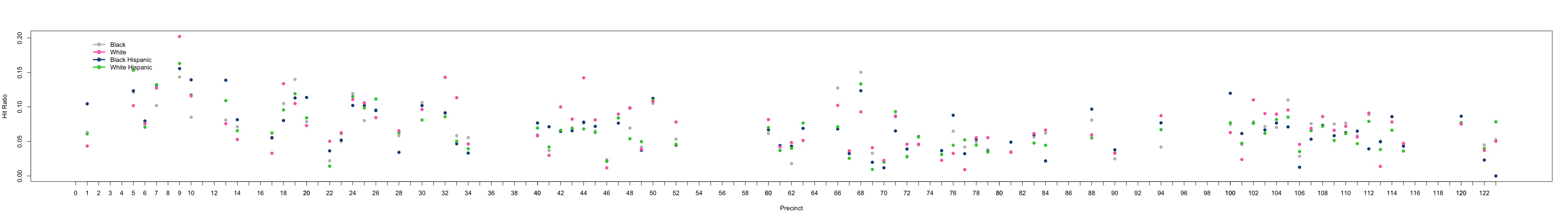
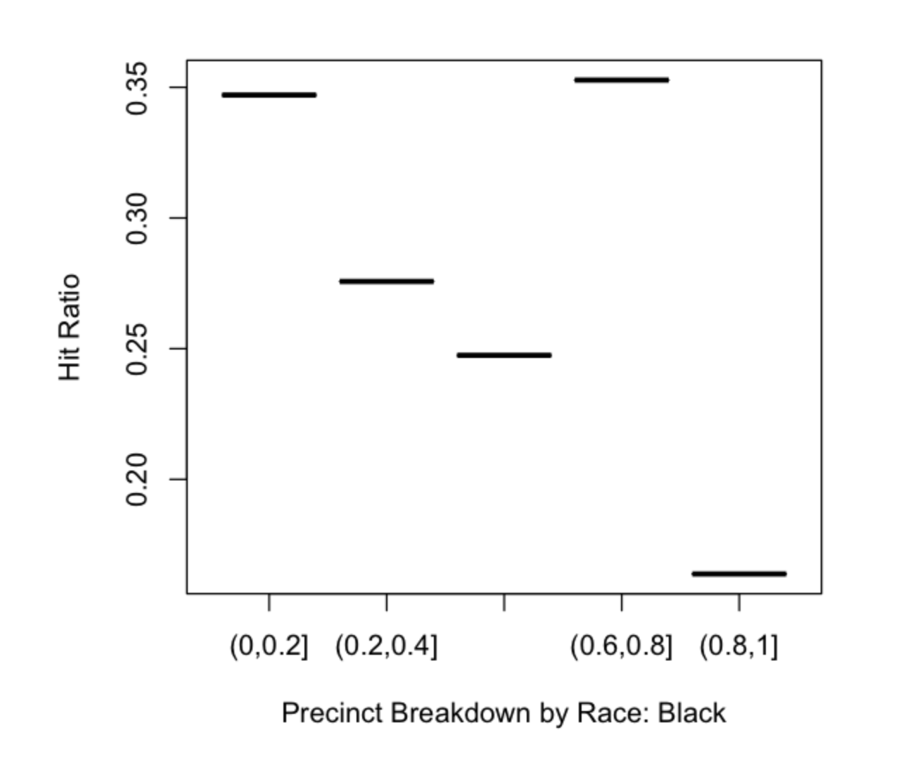
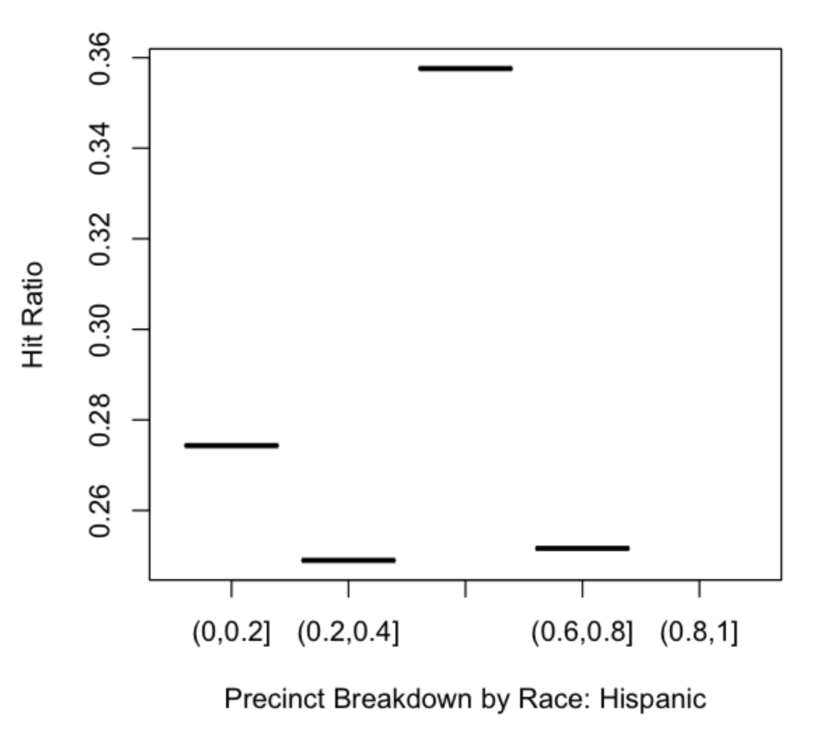
Finally, we discussed a real world example. Consider the NYPD stop and frisk data, which gives the date and location of each of the 600,000 stops that officers make on the street every year. You can plot these on a map. Let’s say that we get a list of mosque addresses, and discover that we discover that there are 15% more stops than average within 100 meters of New York City’s mosques. Given the NYPD history of spying on muslims, do we conclude that the police are targeting mosque-goers?

Let’s call that H1. How many other hypothesis can you imagine that will also explain this fact? (We came up with eight in class.) What kind of information or data or tests would you need to do to decide which hypothesis is the strongest?

The readings for this week were:

Week 9: Social Network Analysis

This week is about the analysis of networks of people, not the analysis of data on social networks. We might mine tweets, but fundamentally we are interested here in the people and their connections — the social network — not the content.

Slides.

Social networks have of course existed for as long as there have been people, and have been the subject of careful study since the early 20th century (see for example this 1951 study which compared groups performing the same a task using different network shapes, showing that “centrality” was an important predictor of behavior.) Recently it has become a lot easier to study social networks because of the amount of data that we all produce online — not just our social networking posts, but all of our emails, purchases, location data, instant messages, etc.

Different fields have different reasons to study social networks. In intelligence and law enforcement, the goal may be to identify terrorists or criminals. Marketing and PR  are interested in how people influence one another to buy things or believe things. In journalism, social network analysis is potentially useful in all four places where CS might apply to journalism. That is, social network analysis could be useful for:

  • reporting, by identifying key people or groups in a story
  • presentation, to show the user how the people in a story relate to one another
  • filtering, to allow the publisher to target specific stories to specific communities
  • tracking effects, by watching how information spreads

Because we’re going to have a whole week on tracking effects (see syllabus) we did not talk about that in class.

In a complex investigative story, we might use social network analysis to identify individual people or groups, based on who they are connected. This is what ICIJ did in their Skin and Bone series on the international human tissue trade. To present a complex story we might just simply show the social network of the people and organizations involved, as in the Wall Street Journal’s Galleon’s Web interactive on the famous insider trading scandal. I haven’t yet heard of anyone in journalism targeting specific audiences identified by social network analysis, but I bet it will happen soon.

Although visualization remains the main technique, there have been a number of algorithms designed for social network analysis. First there are multiple “centrality” measures, which try to determine who is “important” or “influential” or “powerful.” There are many of these.

But they don’t necessarily compute what a journalist wants to know. First, each algorithm is based on a specific assumption about how “things” flow through the network. Betweenness centrality assumes flows are always along the shortest path. Eigenvector centrality assumes a random walk. Whether this models the right thing depends on what is flowing — is it emails? information? money? orders? — and how you expect it to flow. Borgatti explains the assumptions behind centrality measures in great detail.

Often journalists are interested in “power” or “influence.” Unfortunately this is a very complicated concept, and while there is almost certainly some correlation between power and network centrality, it’s just not that simple. Communication Intermediaries — say, a secretary — may have extremely high betweeness centrality without any real authority.

Even worse, your network just may not contain the data you are actually interested in. You can produce a network showing corporate ownership, but if company A owns a big part of company B it doesn’t necessarily mean that A “controls” B. It depends on the precise relationship between the two companies, and how much autonomy B is given. Similar arguments can be made for links like “sits on the board of.”

This also brings up the point that there may be more than one kind of connection between people (or entities, more generally) in which case “social network analysis” is more correctly called “link analysis,” and if you use any sort of algorithm on the network you’ll have to figure out how to treat different types of links.

There are also algorithms for trying to find “communities” in networks. This requires a mathematical definition of a “cluster” of people, and one of the most common is modularity, which counts how many more intra-group edges there are than would be expected by chance in a graph with the same number of edges randomly placed.

Overall, social network analysis algorithms are useful in journalism, but not definitive. They are just not capable of understanding the complex context of a real-world social network. But the combination of a journalist and a good analysis system can be very powerful.

The readings were:

  • Identifying the Community Power Structure, an old handbook for community development workers about figuring out who is influential by very manual processes. I hope this helps you think about what “power” is, which is not a simple topic, and traditional “analog” methods of determining it.
  • Analyzing the data behind Skin and Bone, ICIJ. The best use of social network analysis in journalism that I am aware of.
  • Sections I and II of Community Detection in Graphs. An introduction to a basic type of social network algorithm.
  • Visualizing Communities, about the different ways to define a community
  • Centrality and Network Flow, or, one good reason to be suspicious of centrality measures
  • The Network of Global Corporate Control, a remarkable application of network analysis
  • The Dynamics of Protest Recruitment Through an Online Network, good analysis of Twitter data from Spain “May 20” protest movement
  • Exploring Enron, social network analysis of Enron emails, by Jeffrey Heer who went on to help create the D3 library

Here are a few other examples of the use of social network analysis in journalism:

  • Visualizing the Split on Toronto City Council, a social network analysis that shows evolution over time
  • Muckety, an entire site that only does stories based on link analysis
  • Theyrule.net, an old map of U.S. boards of directors
  • Who Runs Hong Kong?, a story explained through a social network analysis tool, South China Morning Post

Week 8: Knowledge Representation

Journalism has, historically, considered itself to be about text or other unstructured content such as images, audio, and video. This week we ask the questions: how much of journalism might actually be data? How would we represent this data? Can we get structured data from unstructured data?

Slides.

We start with Holovaty’s 2006 classic, A fundamental way newspaper sites need to change, which lays out the argument that the product of journalism is data, not necessarily stories. Central to this is the idea that it may not be humans consuming this data, but software that combines information for us in useful ways — like Google’s Knowledge Graph.

But to publish this kind of data, we need a standard to encode it. This gets us into the question of “what is a general way to encode human knowledge?” which has been asked by the AI community for at least 50 years. That’s why the title of this lecture is “knowledge representation.”

This is a hard problem, but let’s start with an easier one which has been solved: story metadata. Even without encoding the “guts” of a story as data, there is lots of useful data “attached” to a story that we don’t usually think about.

These details are important to any search engine or program that is trying to scrape the page. They might also include information on what the story is “about,” such as subject classification or a list of the entities (people, places, organizations) mentioned. There is a recent standard for encoding all of this sort of information directly within the page HTML, defined by schema.org which is a joint project of Google, Bing, and Yahoo. Take a look at the schema.org definition of a news article, and what it looks like in HTML. If you view the source of a New York Times, CNN, or Guardian article you will see these tags in use today.

In fact, every big news organization has its own internal schema, though some use it a lot more than others. The New York Times has been adding subject metadata since the early 20th century, as part of their (initially manual) indexing service. But we’d really like to be able to combine this type of information from multiple sources. This is the idea behind “linked open data” which is now W3C standard. Here’s Tim Berners-Lee describing the idea.

The linked data standard says each “fact” is described as a triple, in “subject relation object” form. Each of these three items is in turn either a literal constant, or a URL. Linked data is linked because it’s easy to refer to someone else’s objects by their URL. A single triple is equivalent to the proposition relation(subject,object) in mathematical logic. A database of triples is also called a “triplestore.”

There are many sites that already support this type of data. The W3C standard for expressing triples is an XML-based format called RDF, but there is also a much simpler JSON encoding of linked data. Here is what the “linked data cloud” looked like in 2010; it’s much bigger now and no one has mapped it recently.

The arrows indicate that one database references objects in the other. You will notice something called DBPedia at the center of the cloud. This is data derived from all those “infoboxes” on the right side of Wikipedia articles, and it has become the de-facto common language for many kinds of linked data.

Not only can one publisher refer to the objects of another publisher, but the standardized owl:sameAs relation can be used to equate one publisher’s object to a DBPedia object, or anyone else’s object. This expression of equivalence is an important mechanism that allows interoperability between different publishers. (As I mentioned above, every relation is actually a URL, so owl:sameAs is more fully known as http://www.w3.org/2002/07/owl#sameAs, but the syntax of many linked data formats allow abbreviations in many cases.)

DBPedia is vast and contains entries on many objects. If you go to http://dbpedia.org/page/Columbia_University_Graduate_School_of_Journalism you will see everything that DBPedia knows about Columbia Journalism School, represented as triples (the subject of every triple on this page is the school, so it’s implicit here.) If you go to http://dbpedia.org/data/Columbia_University_Graduate_School_of_Journalism.json you will get the same information in machine-readable format. Another important database is GeoNames, which contains machine readable information on millions of geographical entities worldwide — not just their coordinates but their shapes, containment (Paris is in France), and adjacencies. The New York Times also publishes a subset of their ontology as linked open data, including owl:sameAs relations that map their entities to DBPedia entities (example).

So what can we actually do with all of this? In theory, we can combine propositions from multiple publishers to do inference. So if database A says Alice is Bob’s brother, and database B says Alice is Mary’s mother, then we can infer that Bob is Mary’s uncle. Except that — as decades of AI research has shown — propositional inference is brittle. It’s terrible at common sense, exceptions, etc.

Perhaps the most interesting real-world application of knowledge representation is general question answering. Much like typing a question into a search engine, we allow the user to ask questions in human language and expect the computer to give us the right answer. The state of the art in this area is the DeepQA system from IBM, which competed and won on Jeopardy. Their system uses a hybrid approach, with several hundred different types of statistical and propositional based reasoning modules, and terabytes of knowledge both in unstructured and structured form. The right module is selected at run time based on a machine learning model that tries to predict what approach will give the correct answer for any given question. DeepQA uses massive triplestores of information, but they only contain a proposition giving the answer for about 3% of all questions. This doesn’t mean that linked data and its propositional knowledge is useless, just that it’s not going to be the basis of “general artificial intelligence” software. In fact linked data is already in wide use, but in specialized applications.

Finally, we looked at the problem of extracting propositions from text. The Reverb algorithm (in your readings) gives a taste of the challenges involved here, and you can search their database of facts extracted from 500 million web pages. A big part of proposition extraction is named entity recognition (NER). The best open implementation is probably the Stanford NER library, but the Reuters OpenCalais service performs a lot better, and you will use if for assignment 3. Google has pushed the state of the art in both NER and proposition extraction as part of their Knowledge Graph which extracts structured information from the entire web.

Your readings were:


Week 7: Visualization

Sadly, we had to cut this lecture short because of Hurricane Sandy, but I’m posting the slides and a few notes.

You have no doubt seen lots of visualizations recently, and probably even studied them in your other classes (such as Data Journalism.) I want to give you a bit of a different perspective here, coming more from the information visualization (“infovis”) tradition which goes back to the beginnings of computer graphics in the 1970s. That culture recognized very early the importance of studying the human perceptual system, that is, how our eyes and brains actually process visual information.

Take a look at the following image.

You saw the red line instantly, didn’t you? Importantly, you didn’t have to think about this, or go look at each line, one at a time to find it, you “just saw it.” That’s because your visual cortex can do many different types of pattern recognition at a pre-conscious level. It doesn’t take any time or feel like any effort for you. This particular effect is called “visual pop-out” and many different types of visual cues can cause it.

The human visual system can also do pre-conscious comparisons of things like length, angle, size and color. Again, you don’t have to think about it know which line is longer.

In fact, your eye and brain are sensitive to dozens of visual variables simultaneously. You can think of these as “channels” which can be used to encode quantitative information. But not all channels are equally good for all types of information. Position and size are the most sensitive channels for continuous variables, while color and texture aren’t great for continuous variables but work well for categorical variables. The following chart, from Munzer, is a summary of decades of perceptual experiments.

This consideration of what the human visual system is good at — and there’s lot’s more — leads to what I call the fundamental principle of visualization: turn something you want to find into something you can see without thinking about. 

What kinds of “things” can we see in a visualization? That’s the art of visualization design! We’re trying to plot the data such that the features we are interested in are obviously visible. But here are some common data features that we can visualize.

The rest of the lecture — which we were not able to cover — gets into designing visualizations for big data. The key principle is, don’t try to show everything at once. You can’t anyway. Instead, use interactivity to allow the user to explore different aspects of the data. In this I am following the sage advice of Ben Fry’s Computational Information Design approach, and also drawing parallels to how human perception works. After all, we don’t “see” the entire environment at once, because only the central 2 degrees of our retina are sharp (the fovea.) Instead we move our eyes rapidly to survey our environment. Scanning through big data should be like this, because we’re already built to understand the world that way.

In the final part of the lecture — which we actually did cover, briefly — we discussed narrative, rhetoric and interpretation of visualizations. Different visualizations of the same data can “say” completely different things. We looked at a simple line graph and asked, what are all the editorial choices that went into creating it?

I can see a half dozen choices here; there are probably more.

  • The normalization used — all values are adjusted relative to Jan 2005 values
  • Choice of line chart (instead of any other kind)
  • Choice of color. Should thefts be blue, or would red have been better?
  • Time range. The data probably go back farther.
  • Legend design.
  • Choice of these data at all, as opposed to any other way to understand bicycle use and thefts.

Also, no completed visualization is entirely about the data. If you look at the best visualization work, you will see there there are “layers” to it. These include:

  • The data. What data is chosen, what is omitted, what are the sources.
  • Visual representation. How is the data turned into a picture.
  • Annotation. Highlighting, text explanations, notes, legends.
  • Interactivity. Order of presentation, what the user can alter.

In short, visualization is not simply a technical process of turning data into a picture. There are many narrative and editorial choices, and the result will be interpreted by the human perceptual system. The name of the game is getting a particular impression into the user’s head, and to do that, you have to a) choose what you want to say and b) understand the communication and perception processes at work.

Readings for this week were:

I also recommend the book Designing Data Visualizations.

Assignment 3

For this assignment you will evaluate the performance of OpenCalais, a commercial entity extraction service. You’ll do this by building a text enrichment program, which takes plain text and outputs HTML with links to the detected entities. Then you will take five random articles from your data set, enrich them, and manually count how many entities OpenCalais missed or got wrong.

1. Get an OpenCalais API key, from this page.

2. Install the python-calais module. This will allow you to call OpenCalais from Python easily. First, download the latest version of python-calais. To install it, you just need calais.py in your working directory. You will probably also need to install the simplejson Python module. Download it, then run “python setup.py install.” You may need to execute this as super-user.

3. Call OpenCalais from Python. Make sure you can successfully submit text and get the results back, following these steps. The output you want to look at is in the entities array, which would be accessed as “results.entities” using the variable names in the sample code. In particular you want the list of occurrences for each entity, in the “instances” field.

>>> result.entities[0]['instances']
[{u'suffix': u' is the new President of the United States', u'prefix': u'of the United States of America until 2009.  ', u'detection': u'[of the United States of America until 2009.  ]Barack Obama[ is the new President of the United States]', u'length': 12, u'offset': 75, u'exact': u'Barack Obama'}]
>>> result.entities[0]['instances'][0]['offset']
75
>>>

Each instance has “offset” and “length” fields that indicate where in the input text the entity was referenced. You can use these to determine where to place links in the output HTML.

4. Read from stdin, create hyperlinks, write to stdout. Your Python program should read text from stdin and write HTML with links on all detected entities to stdout. There are two cases to handle, depending on how much information OpenCalais gives back.

In many cases, like the example in the previous step, OpenCalais will not be able to give you any information other than the string corresponding to the entity, result.entities[x][‘name’]. In this case you should construct a Wikipedia link by simply appending to the name to a Wikipedia URL, converting spaces to underscores, e.g.

http://en.wikipedia.org/wiki/Barack_Obama

In other cases, especially companies and places, OpenCalias will supply a link to an RDF document that contains more information about the entity. For example.

>>> result.entities[0]{u'_typeReference': u'http://s.opencalais.com/1/type/em/e/Company', u'_type': u'Company', u'name': u'Starbucks', '__reference': u'http://d.opencalais.com/comphash-1/6b2d9108-7924-3b86-bdba-7410d77d7a79', u'instances': [{u'suffix': u' in Paris.', u'prefix': u'of the United States now and likes to drink at ', u'detection': u'[of the United States now and likes to drink at ]Starbucks[ in Paris.]', u'length': 9, u'offset': 156, u'exact': u'Starbucks'}], u'relevance': 0.314, u'nationality': u'N/A', u'resolutions': [{u'name': u'Starbucks Corporation', u'symbol': u'SBUX.OQ', u'score': 1, u'shortname': u'Starbucks', u'ticker': u'SBUX', u'id': u'http://d.opencalais.com/er/company/ralg-tr1r/f8512d2d-f016-3ad0-8084-a405e59139b3'}]}
>>> result.entities[0]['resolutions'][0]['id']
u'http://d.opencalais.com/er/company/ralg-tr1r/f8512d2d-f016-3ad0-8084-a405e59139b3'
>>>

In this case the resolutions array will contain a hyperlink for each resolved entity, and this is where your link should go. The linked page will contain a series of triples (assertions) about the entity, which you can obtain in machine-readable from by changing the .html at the end of the link to .json. The sameAs: links are particularly important because they tell you that this entity is equivalent to others in dbPedia and elsewhere.

Here is more on OpenCalias’ entity disambiguation and use of linked data.

5. Pick five random documents and enrich them. Choose them from the document set you worked with in Assignment 1.  It’s important that you actually choose randomly — as in, use a random number generator. If you just pick the first five, there may be biases in the result. Using your code, turn each of them into an HTML doc.

6. Read the enriched documents and count to see how well OpenCalais did. You need to read each output document very carefully and count three things:

  • Entity references. Count each time there is a name of a person, place, or organization, including pronouns (such as “he”) or other references (like “the president.”)
  • Detected references. How many of these did OpenCalais find?
  • Correct references. How many of the links go to the right page? Did our hyperlinking strategy (OpenCalais RDF pages where possible, Wikipedia when not) fail to correctly disambiguate any of the references, or, even worse, disambiguate any to the wrong object?

7. Turn in your work. Please turn in:

  • Your code
  • The enriched output from your documents
  • A brief report describing your results.

The report should include a table of the three numbers — references, detected, correct — for each document, as well as overall percentages across all documents. Also report on any patterns in the failures that your see. Where is OpenCalais most accurate? Where is it least accurate? Are there predictable patterns to the errors?

Due before class on Monday, November 19.